Separate Depth from Undertone
A foundation mismatch is rarely an issue of simple lightness or darkness. In over eighty percent of shade complaints, the wearer has chosen the correct depth tier but placed it on an opposing undertone spectrum.
What Makes Depth Different from Undertone?
Depth represents where you land on the photometric light-absorption ladder—often categorized by brands from 1 (Fair) to 8 (Deep Espresso). Depth can shift seasonally through melanin activation from sun exposure.
Undertone is the persistent underlying spectral pigment matrix beneath your epidermis. Unlike surface redness from rosacea, sun exposure, or acne flushes, your undertone remains constant your entire life. It dictates whether light reflected off your skin leans toward red-blue (cool), golden-yellow (warm), balanced equal-measure (neutral), or green-gray (olive).
When you attempt to correct surface redness by buying an overly cool pink foundation, you inadvertently stack red upon red, creating an inflamed mask. True neutralization requires matching your neck's underlying tone, allowing the cosmetic pigments to harmonize with your clavicle and shoulders.
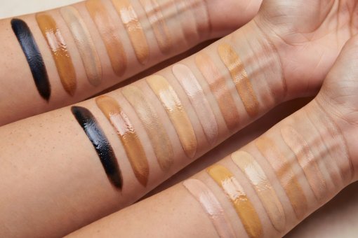
The Four Primary Undertone Categories
Blue, Pink & Red Infusion
Veins near the surface appear rich violet or slate blue. Silver metals harmonize cleanly against the collarbone without looking harsh. When exposed to harsh sun without protection, skin typically burns before developing modest pigment.
Common Matching Mistake: Choosing foundations that are too chalky or frosty, turning ashen on medium to deep complexions.
Gold, Peach & Amber Infusion
Veins appear olive-green or sea-foam tint through the stratum corneum. Yellow gold jewelry blends fluidly with skin tone. Skin tans readily, developing golden bronze or deep rich red-brown tones.
Common Matching Mistake: Buying formulas packed with synthetic ochre, which dry down into an unnatural orange rim around the chin.
Even Red-Yellow Equilibrium
Veins display a blend of blue and greenish tones. Both silver and gold jewelry appear natural against the décolletage. Skin burns initially only under extreme UV and gradually deepens into an even tone.
Common Matching Mistake: Confusing surface redness with cool undertone and bypassing the neutral balance your neck displays.
Green & Gray Undertone
Features a distinctive greenish-ash cast created by a high concentration of blue-green pigments alongside pale yellow. Extremely common across Mediterranean, Asian, Latin, and deeply pigmented lineages.
Common Matching Mistake: Brands often omit olive categories, forcing wearers to choose between looking jaundiced (warm) or chalky-pink (cool).
Interactive Shade Assessment Workspace
Adjust the depth level and select an undertone parameter to observe the diagnostic checklist for identifying mismatches in real-world lighting.
You are examining Depth Tier 3 with a Neutral undertone. In natural north-facing daylight, look for whether this tint shows excess peach/pink (too cool) or an orange/yellow halo (too warm).
The Physics of Foundation Oxidation
Have you ever applied a foundation that matched seamlessly on your jawline, only to look in the mirror two hours later and find your face distinctly two shades darker and warmer? This is the consequence of chemical oxidation.
Foundation formulas are complex emulsions containing iron oxides, zinc, titanium dioxide, talc, and botanical or silicone oils. When these pigments interact with your skin's unique sebum pH, atmospheric oxygen, and environmental humidity, the chemical balance shifts. As the volatile liquids evaporate during set-down, the dry pigments consolidate, routinely shifting the overall tone warmer by up to one full shade.
How to Test for Oxidation:
- Apply a clean 2-inch vertical stripe along your jaw down to your neck.
- Leave the stripe undisturbed for a minimum of twenty minutes without rubbing.
- Right next to the dry swatch, apply a fresh wet dab of the exact same product from the bottle.
- Compare the two under indirect daylight. If the dry swatch has darkened or turned significantly more orange, size down half a shade or choose a cooler neutral to compensate.